10 Sep 2026 · Vox · Video Studio · Prompt · Claude
How a Vox-style explainer is built
It used to take a writer, an illustrator, an animator and a week. Now: four lines of text.
00 · What a video is made of
A beat has four layers: script, images, voiceover, text.

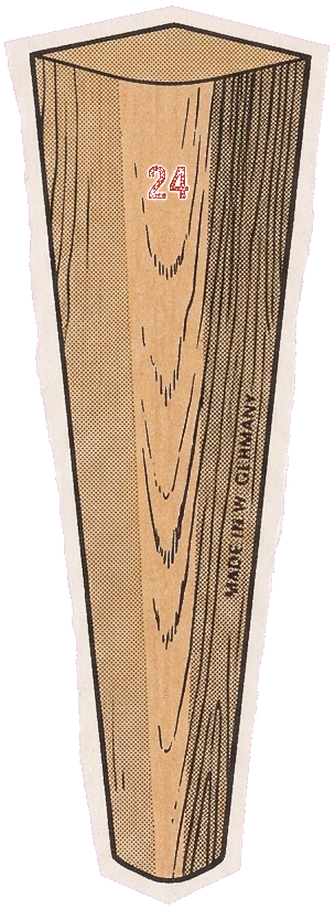
“In 1956 an employee sawed a table’s legs off to fit his car. Flat-pack was born.”
01 · What you are actually making
A film is eight beats. Each beat: script, images, voiceover, text.
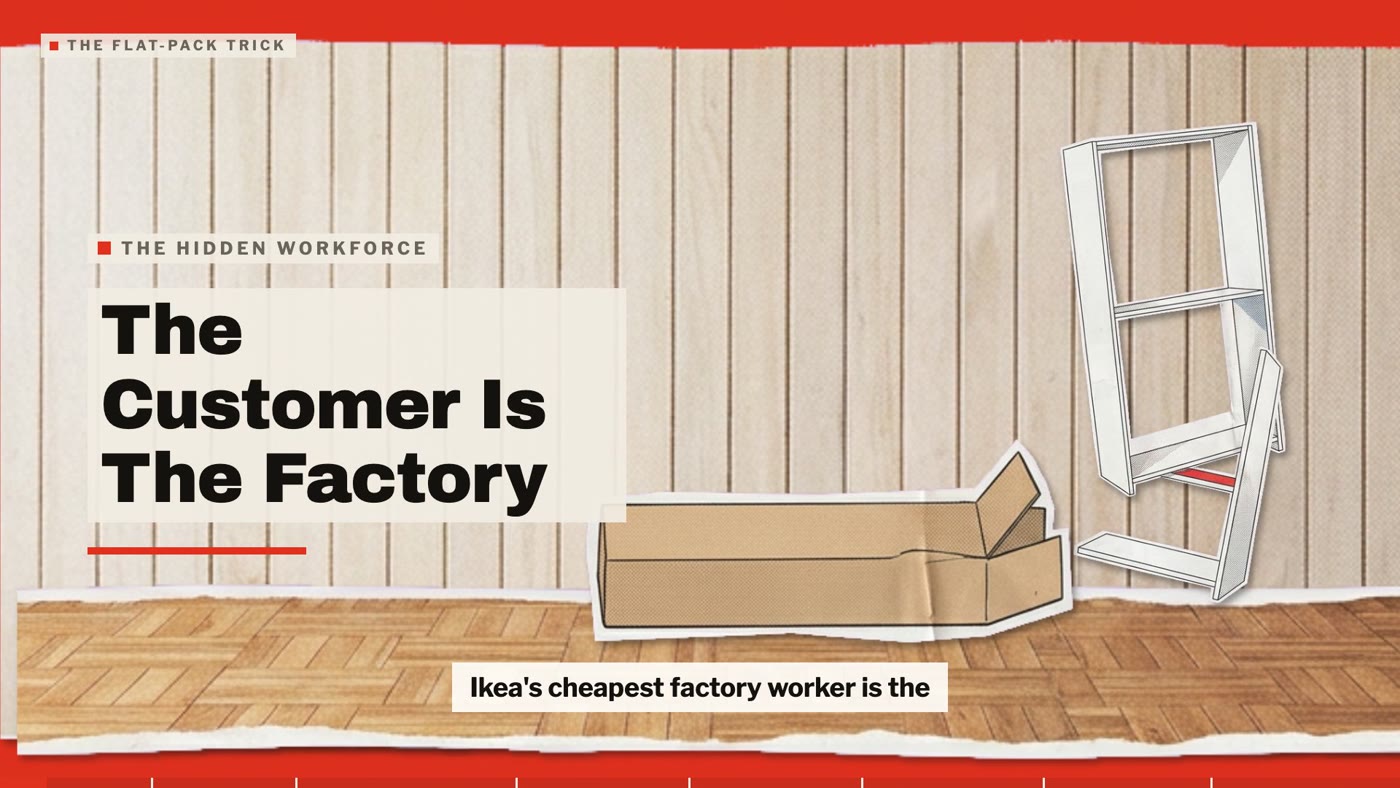
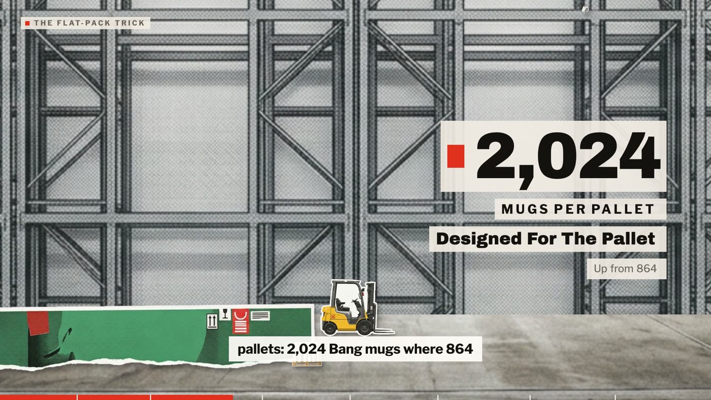
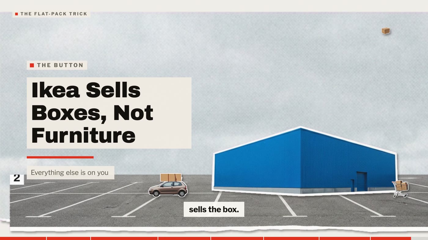
“IKEA didn't get cheap by building less. It made you the factory's last worker.”
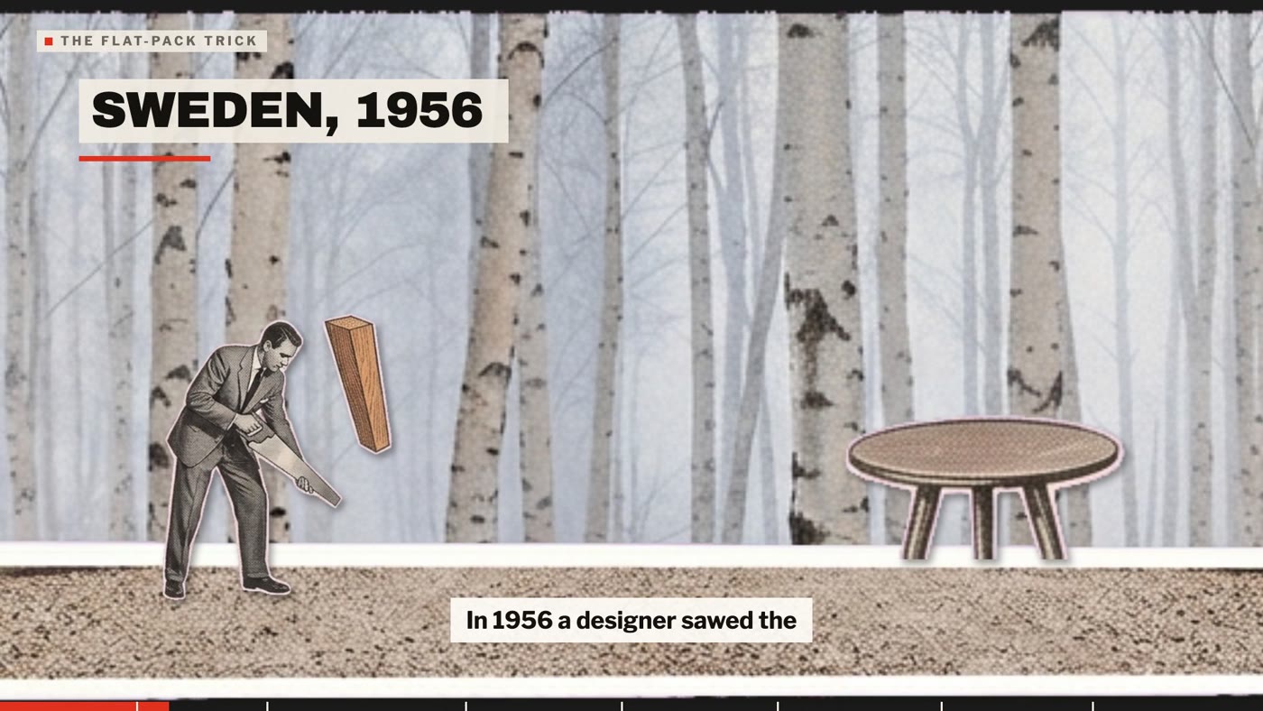
“In 1956 an employee sawed a table's legs off to fit his car. Flat-pack was born.”
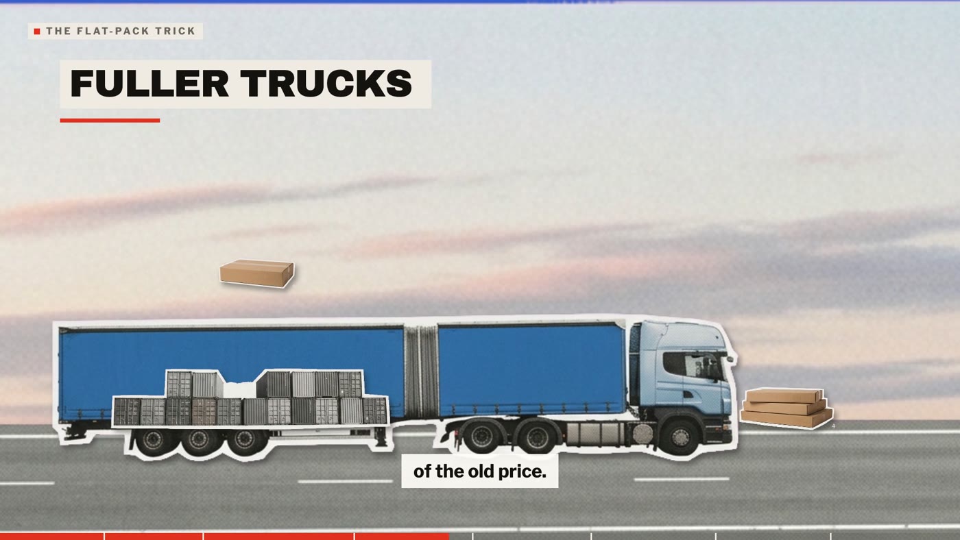
“Air is the priciest thing to ship, and a flat box carries none.”
“The Billy bookcase, launched 1979, has sold more than 100 million units.”
“Founded in 1943, IKEA still sells the same bargain: you do the work.”
- Script. One sentence, about 13 words. The story block.
- Images. Four to six paper cut-outs standing in one place.
- Voiceover. The sentence read aloud, recorded or an AI voice.
- Text. A title, a stat when there is a number, and the subtitles.
Eight beats is one minute.
The beat sheet · the IKEA film, all eight beats
| # | Script | Images | Voiceover | Text |
|---|---|---|---|---|
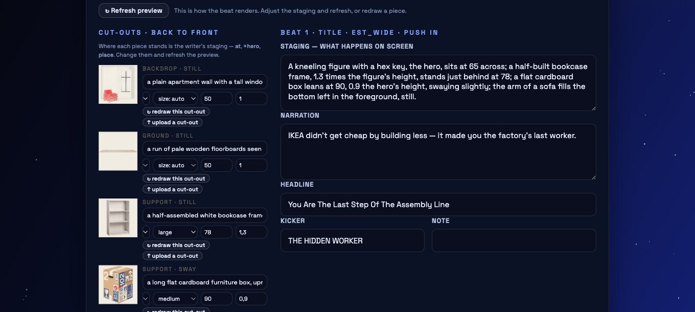
| 1 | IKEA didn't get cheap by building less. It made you the factory's last worker. | a person kneeling, hex key raised+ 5 more pieces | 14 words · AI voice or recorded | THE HIDDEN WORKERYou Are The Last Step Of The Assembly Line+ subtitles |
| 2 | In 1956 an employee sawed a table's legs off to fit his car. Flat-pack was born. | a table top with no legs+ 5 more pieces | 15 words · AI voice or recorded | SWEDEN, 1956The Table That Wouldn't Fit1956flat-pack born+ subtitles |
| 3 | Air is the priciest thing to ship, and a flat box carries none. | a pallet of strapped flat boxes+ 5 more pieces | 13 words · AI voice or recorded | SHIP NO AIRAir Costs More Than Furniture+ subtitles |
| 4 | Designers get the price tag first, then invent a product that hits it. | a swing price tag on a string+ 5 more pieces | 13 words · AI voice or recorded | PRICE FIRSTThe Price Tag Comes Before The Chair+ subtitles |
| 5 | Dowels and a hex key replace paid assembly. Your Saturday is the missing wage. | an L-shaped hex key+ 5 more pieces | 14 words · AI voice or recorded | UNPAID LABOURYour Saturday Is The Missing Wage+ subtitles |
| 6 | The Billy bookcase, launched 1979, has sold more than 100 million units. | a white bookcase full of books+ 5 more pieces | 10 words · AI voice or recorded | BILLYOne Bookcase, A Planet Of Shelves100 millionBillys sold+ subtitles |
| 7 | So the low price is real. The cost just moved from factory to living room. | a small house with a lit window+ 5 more pieces | 15 words · AI voice or recorded | THE COST MOVEDCheaper Because The Work Went Home+ subtitles |
| 8 | Founded in 1943, IKEA still sells the same bargain: you do the work. | a boy in a flat cap holding a parcel+ 5 more pieces | 12 words · AI voice or recorded | SMÅLANDFrom Småland Farm To Your Floor1943founded+ subtitles |
02 · Inside one beat
Every beat is a pop-up book. Six layers, back to front.
Most people ask the image model for a scene. That is the mistake. You ask for the parts, then you stack them. This is beat 2 of the IKEA film, the same beat as the frame above. Watch it assemble.
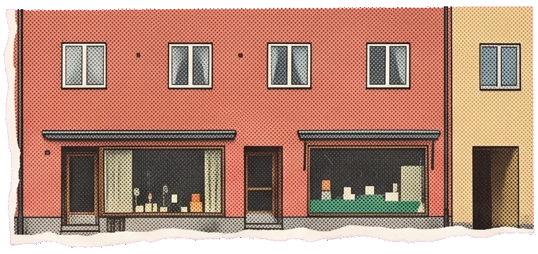
- backdropA row of 1950s Swedish shop fronts. Full panel. Holds still.
- groundA strip of gravel road, seen edge-on. One thin strip.
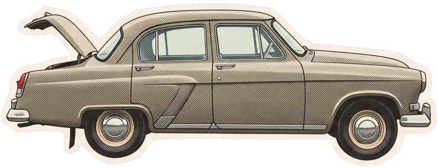
- supportThe sedan, boot open, twice the table’s height. Still.
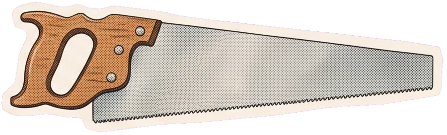
- supportA hand saw at 0.6 of the hero. Rocks gently.
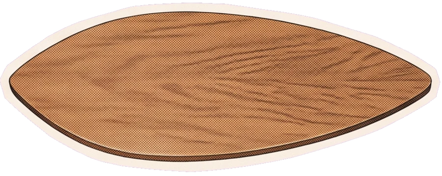
- heroThe table top with no legs. Scale 1. Everything is measured against it.
- accentOne sawn-off leg, 0.4 of the hero. Spins and sinks.
03 · The trick nobody sees
One image per beat. On magenta.
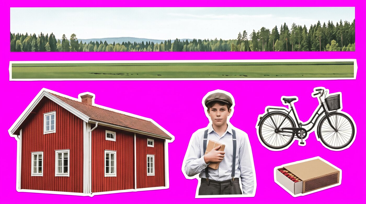
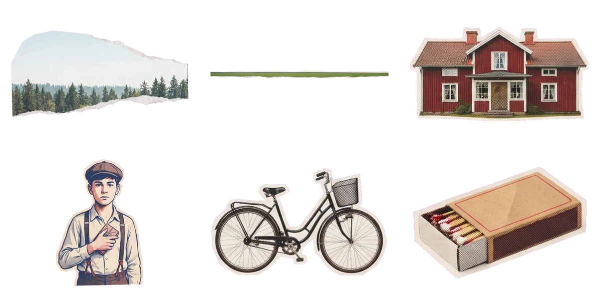 1 · The model draws the sheet
2 · Delete the magenta. Pieces.
1 · The model draws the sheet
2 · Delete the magenta. Pieces.
Why magenta?
Beat 8 of the IKEA film: a pine forest, a field, a farmhouse, a boy with a parcel, a bicycle, a matchbox.
Because no paper collage on earth has pure magenta in it. So the computer can delete that one colour and keep everything else, edge to edge, with no manual masking.
- All of a beat’s pieces go on one sheet, never touching.
- The backdrop is a wide panel on top. The ground is a thin strip. The rest sit in a grid.
- The Video Studio slices the sheet on the gaps automatically. By hand it is one Color Range selection in Photoshop.
- A piece that came out wrong gets redrawn alone, same style, and dropped back in.
04 · The whole system on one screen
Seven steps. You do two of them.
| # | Step | What happens | Who |
|---|---|---|---|
| 1 | Four lines | Topic, arc, number of beats, ratio. | You |
| 2 | Beat sheet | Narration, layout, shot, staging and pieces for every beat, as one JSON. | Claude |
| 3 | Sheet prompts | One image prompt per beat: all its pieces, on magenta, in a grid. | Claude |
| 4 | Draw | One image per beat, in the film’s theme. | Image model |
| 5 | Cut | Key out the magenta. Each piece becomes a transparent PNG. | Video Studio |
| 6 | Voice | One line per beat, recorded or generated. Word timing drives the captions. | You or AI voice |
| 7 | Render | Camera moves, parallax, paper texture, cuts, captions, music. Nothing to prompt. | Video Studio |
Change your mind later? “Redraw beat 3 piece 2” redraws one piece. “Revise: the leaf is too small” fixes the sheet and only the prompts that changed. Nothing else is touched.
05 · Pick a look, once
Ten themes. Every piece in the film gets the same one.
That is why the film looks art-directed instead of assembled. Style is decided once, at the top, and never mentioned in a piece again.
Make one by hand
Claude writes. Nano Banana draws. ElevenLabs speaks. Claude renders.
-
1Open Claude. Paste the prompt. Change the four lines at the top.Nothing to install. Claude answers with the beat sheet and one SHEET PROMPT per beat, then tells you what to do next and keeps driving.
TOPIC: Why the price of oil moves the whole world economy ARC: hook_payoff BEATS: 8 RATIO: 16:9 You are running a Vox-style paper-collage explainer pipeline with me, in this chat. The film itself is already built: a Remotion renderer takes a JSON beat sheet plus one cut-out PNG per piece and does everything else — camera, parallax, texture, cuts, narration, captions, music. Never write or suggest code, setup or rendering advice; we are not building anything. You are the staff writer and art director, and you also DRIVE the steps: after each step you immediately hand me the next one, you never ask questions, never offer options, never add preambles or caveats. Anything ambiguous, decide it for the topic and say so in one line. The four lines at the top are the only inputs; everything else is fixed below. BEATS is the number of beats to write and overrides any count mentioned later; the script's word budget is BEATS × 13 words. ════ STEP 1 — THE BEAT SHEET ════ You are a staff writer AND art director for a Vox-style paper-collage explainer video: authoritative, plain-spoken, numbers-first. You write the NARRATION, you call the SHOT, and you describe the COLLAGE POSTER behind every beat. ARC. This film is a "hook_payoff" — Hook -> Context -> Build -> Payoff -> Button. Open on the stakes, earn the answer, land it. Shape the beats to that arc. HOOK. Beat 1 has about three seconds to earn the rest. It must land a bold claim, a surprising figure, a provocative question or a "you have this backwards" — never setup, never a definition, never throat-clearing. NARRATION. One short spoken sentence per beat (about 12-18 words, never over 26). The beats must read as ONE continuous voiceover — no beat restates another, no "in this video", no addressing the viewer. The whole script is about 104 words. Every factual number must be one you are confident about; if you are unsure of a figure, write the beat without a number rather than inventing one. THEME. Pick ONE visual theme for the WHOLE film and name it once, at the top. Match it to the TOPIC's era, culture and tone — not to the language it is narrated in (an English film about Tang-dynasty China should still look Chinese). Choose from: "american-retro" — American retro — 1950s ad & pulp; fits ads, sports, business, money, consumer culture "swiss-modern" — Swiss modern — International Typographic; fits technology, finance, systems, process explainers "punk-zine" — Punk zine — photocopied DIY; fits rebellion, music, counterculture, protest, the internet "soviet-constructivist" — Constructivist — bold diagonal photomontage; fits politics, revolution, industry, labour, power "wpa-propaganda" — WPA poster — 1930s silkscreen; fits history, public health, infrastructure, nature, labour "70s-groovy" — 70s groovy — riso warmth; fits culture, food, nostalgia, music, lifestyle "chinese-ink" — Chinese ink — woodblock & seal; fits Chinese history and culture, philosophy, tea, dynasties "atomic-age" — Atomic age — 1950s futurism; fits science, space, the future, invention, medicine "newsprint-editorial" — Newsprint editorial — front-page feature; fits news, AI and tech explainers, investigations, editorial features "gilded-deco" — Gilded deco — 1920s luxury; fits luxury goods, heritage brands, fashion, watches, wine LAYOUT. EVERY beat must put words on screen — a headline, or a stat, or bullets. A beat with no text is a silent slide, never ship one. Each beat picks ONE layout: - "scene": the collage carries the beat. headline (<= 9 words) + optional kicker. - "title": a hard-hitting statement. headline (<= 8 words) + optional kicker + optional note. - "stat": one figure. stat MUST contain digits (e.g. "$32", "39 TRILLION", "68%") — never a phrase like "WEEKS TO LOAD"; statLabel is the 1-3 word unit beside it (e.g. "PER BARREL"). Optional headline/note. The narration MUST speak that number. If you have no figure you are confident about, use a different layout. kicker is at most 4 words. Beat 1 is "title". Use "stat" for at least a quarter of the beats. Never the same layout three times running. SHOT. Give every beat a "shot" (EST_WIDE|WIDE|MEDIUM|CLOSE|DETAIL) — how close the composition sits. Open wide to orient, move closer as the point sharpens, pull out to land the takeaway. Do not use the same size three times running. THE SCENE. A beat is not a set of related pictures — it is ONE SCENE, built out of paper cut-outs in depth: something behind, a surface underneath, the subject standing on it, a scrap or two flying past. Pieces that merely sit near each other read as clip art floating on a colour; pieces that stand in a place read as a collage. Build every beat from 4 to 6 pieces. Each piece is {"role": one of backdrop|ground|support|hero|accent|foreground, "prompt": what that ONE piece shows, "motion": how it moves}, listed back to front: backdrop — the setting behind everything — a forest canopy, a city skyline, a sky, a wall of newsprint, a map ground — the surface the scene stands on — ground, a road, water, a factory floor, rubble support — something standing in the scene beside or behind the main subject (two or three of these) hero — the beat's main subject — the one thing the narration is about, standing in front accent — a small scrap flying through the scene — a numeral, an arrow, a bird, a torn strip, a coin foreground — something close to the viewer that the scene stands behind — a desk edge, a railing, a wave crest, a bank of grass Never make a piece that is only a number, a word or a caption — the type layer sets those; a piece is an OBJECT. A piece FACES the way it moves: describe a travelR piece facing right and a travelL piece facing left, or a car crosses the frame in reverse. EVERY beat gets exactly one "hero", one "backdrop" AND one "ground" — no exceptions. The backdrop is the distance and holds still; the ground is the MIDGROUND, the surface of the place, and it drifts slightly against the backdrop, which is what gives the frame its depth. Everything else stands between them or in front. A beat without both reads as objects floating on a colour. Two or three "support" pieces. At most two "accent" pieces — a scrap in every slot reads as a formula. The backdrop is PURE DISTANCE and is always painted BEHIND everything: sky, haze, a far wall, a field of colour. Never put an object, a figure, a swoosh, a burst or anything the narration mentions INSIDE the backdrop's own picture — whatever matters is its own piece, in front, or it will read as background swallowing the scene. The ground likewise is only the surface itself, seen nearly edge-on. The pieces must belong to ONE PLACE at ONE MOMENT: a backdrop of rainforest canopy, a ground of cleared earth, a bulldozer standing on it, a felled trunk beside it. Not a jar, a map, a chart and an orangutan — those are four illustrations of a topic, not a scene. Each piece's prompt describes ONLY that piece, as a single isolated object seen straight on: "a bulldozer, side view" / "a strip of cleared earth" / "a wall of rainforest canopy". Never describe a whole scene in one piece, never mention where it sits or what it is next to, and never mention style, colour, palette, background or texture — all of that is fixed for you, identically on every beat, which is what makes the film look art-directed instead of assembled. Name the OBJECT, and its POSE if the pose carries the meaning — never an action it performs on its surroundings. An action needs a setting to be legible, so the image model draws the setting too, fused to the piece, and it cannot be cut off afterwards. Write "a climber in red gear, leaning back on a taut rope, exhausted" — not "a climber descending a slope". "A felled trunk, cut end towards us" — not "a trunk lying in a clearing". Verbs like descending, crossing, wading, standing on, emerging from, sinking into and perched on name the SETTING as much as the subject: use the pose instead. Each piece must make sense lying by itself on a table, with nothing beneath it. NO TWO PIECES MAY READ AS THE SAME THING. Two brown bands, a map behind a globe, three pieces that all say "logging" — these come back looking like one image repeated. Every piece must be a PHYSICAL OBJECT that could be cut out of paper with scissors. Never ask for an effect, an overlay, a vignette, a glow, a gradient, a light ray, a motion trail or a split screen — those cover the frame instead of composing in it. Every piece must also be RECOGNISABLE on its own at a glance. Never ask for a blank page, an empty sheet, plain paper, a bare surface or a texture — those come back as an empty rectangle and land on screen as one. When the subject is abstract, use something concrete that stands for it: a growing stack of coins rather than "compound growth", a piggy bank or a bank vault rather than "savings", a clock rather than "time". The headline is typeset over the collage in the edit, so never ask for a headline, a title or a caption. A numeral or a stamped word is fine when it IS one of the pieces. STAGING. Before you place anything, write the beat's "staging": one sentence saying what HAPPENS on screen during it and where — every object named, with its place, its size and what it does. "The sledge crosses the bottom of the frame left to right while the flag turns slowly in the top right corner, small." That sentence is the plan; the fields below must then match it. A beat staged as a list of objects sitting still is a slide, not a shot. THE STAGING AND THE PIECES ARE THE SAME SCENE, named twice. Every object the staging mentions MUST be one of the listed pieces, and every piece must appear in the staging — a staging that says "a sunbeam hits the leaf" while the pieces list no sunbeam describes a film that cannot be made, because the screen can only ever show the pieces. Each piece's place, size and motion are the TRANSCRIPTION of what the staging says about it: "the crystal spins into view at the bottom left, small" becomes {"place": "bottomLeft", "size": "small", "motion": "spin+grow"}. And stage only what paper can do: the pieces are flat cut-outs that slide, turn, scale and enter or leave — nothing glows, shines, melts, morphs, splashes or emits light. If a ray of light matters, the ray is a PIECE. Then STAGE EXACTLY. Every piece that stands or flies gets "at" — where its centre is, as a percentage across the PICTURE (0 = the frame's left edge, 100 = its right; the words hold one side on title, list and stat beats, so stand the scene on the other) — and "scale", its height AGAINST THE HERO'S: the hero is always 1, so "a droplet twice the size of the bee" with a bee hero makes the droplet {"scale": 2}, and a distant hut half its height is {"scale": 0.5}. State both in the staging sentence itself ("the droplet, twice the bee's size, hangs at a third across") and transcribe them into the fields — what you write is followed to the number — but no support below 0.35 and no accent below 0.22: on screen a piece under a quarter of the hero is a speck. The coarse "place" (topLeft|top|topRight|left|center|right|bottomLeft|bottom|bottomRight) and "size" (tiny|small|medium|large|huge) still exist as a fallback when a piece genuinely has no exact position, and a piece with neither is staged automatically. Backdrops and grounds ignore all of this — they always fill the frame. STAGE THE BEAT, do not spread it: the thing the narration is about goes where the eye lands and is the biggest thing there, and everything else is placed in relation to it. Do not give every piece the same place, and do not put two pieces in the same square unless one is meant to be behind the other. Keep the subject off the square the type holds — you can leave place unset and it will be staged for you. MOTION. Give every piece a "motion" that suits WHAT IT IS — this is yours to choose, and the reason to: a boat rocks on water, a bird flies across the frame, a coin spins, a chimney stands perfectly still. Every piece moving with the same gentle wobble reads as a picture wobbling, not as a scene. Pick one, or join two with "+" (e.g. "bob+travelR"). Repeating in place: still, bob (up and down), rock (tilts), sway, driftX (side to side), rotate, pulse. Once across the beat: grow, shrink, spin, travelL, travelR (crosses the frame), riseUp, sink. The backdrop and the ground should almost always be "still" — they are what everything else moves against, and a drifting background makes the whole frame swim. The beat sheet is this JSON (no prose before it, no code fences): {"title": a 2-4 word uppercase slug for the film, "theme": one theme name from the list above, "beats": [{"layout": "...", "shot": "...", "narration": "...", "kicker": "", "headline": "", "stat": "", "statLabel": "", "note": "", "bullets": [], "staging": "...", "pieces": [{"role": "...", "prompt": "...", "at": 0-100, "scale": number, "place": "", "size": "", "motion": "..."}]}]} Always include every key on every beat; use "" or [] for the ones that layout does not need. Never leave "pieces" empty. ════ STEP 2 — THE IMAGE PROMPTS ════ Right after the JSON, in the same reply, write one image prompt per beat, headed "SHEET PROMPT — BEAT n", in a code block each so I can copy it. It is this template with the brackets filled in and nothing else changed. [THEME SENTENCE] is the sentence for the theme you chose: "american-retro": Vintage 1950s-60s American advertising and pulp-magazine paper collage: mid-century engraved and illustrated cut-out figures, classic Americana printed imagery, nostalgic. Palette: bold retro primaries — red, mustard, teal, cream. Print finish: heavy halftone dots, aged newsprint, slight print misregistration. Accent #D8442F; fields #B8352C, #D9902A, #2C5D63, #E8DCC8, #1D1B18. "swiss-modern": Clean Swiss / International Typographic paper collage: bold flat-colour cut-outs, confident geometric shapes, a strict modular grid, crisp infographic editorial layout. Palette: two flat colours plus one red accent, generous white space. Print finish: clean flat ink, very subtle paper grain. Accent #E0301E; fields #E0301E, #1B1B1B, #F2F0EB, #3A5FCD, #D8D4CC. "punk-zine": Gritty punk zine / ransom-note collage: torn newspaper and magazine scraps, cut-out mismatched headline letters, photocopied high-contrast halftone, raw hand-cut edges. Palette: black and white plus one fluorescent spot colour. Print finish: photocopy grain, heavy misregistration, toner blotches. Accent #FF2E88; fields #1A1A1A, #FF2E88, #F2F2F2, #4A148C, #FFE800. "soviet-constructivist": Russian Constructivist photomontage: bold diagonal geometry, cut-out photographic figures at dramatic scale, hard-edged shapes driving the eye across the frame. Palette: red, black and cream only. Print finish: letterpress ink, coarse newsprint. Accent #C81E1E; fields #C81E1E, #1A1A1A, #E9DFC9, #8C1414, #2B2B2B. "wpa-propaganda": 1930s WPA / vintage travel silkscreen poster collage: simplified flat-plane illustration, strong stylised landscape and figure shapes, civic poster composition. Palette: muted three-colour screenprint. Print finish: screenprint grain, flat opaque ink. Accent #C25A2B; fields #2E5E4E, #C25A2B, #E4D9BC, #3D5A6C, #8A6F3C. "70s-groovy": 1970s groovy print collage: bulbous organic shapes, warm illustrated cut-outs, sun-faded magazine imagery. Palette: mustard, rust, avocado and cream. Print finish: risograph grain, warm overprint. Accent #C4622D; fields #C4622D, #D9A62E, #5F7A3C, #E8DCC8, #7A4326. "chinese-ink": Mixed-media collage of Chinese woodblock-print and ink-mural cut-out figures, aged rice-paper and Chinese newspaper clippings, vermilion seal stamps. Palette: ink black and vermilion on aged paper. Print finish: rice paper, ink bleed, fibrous torn edge. Accent #B22222; fields #E9E2D2, #B22222, #2B2B27, #C9BBA4, #6E7B6A. "atomic-age": 1950s atomic-age retro-futurist collage: starbursts, orbital arcs, boomerang shapes, optimistic illustrated science imagery. Palette: teal, orange and cream. Print finish: halftone dots, starburst accents. Accent #E2622F; fields #1E7F87, #E2622F, #F0E6D2, #2B4A57, #D9B44A. "newsprint-editorial": Vintage newsprint editorial collage in the manner of a mid-century front-page news feature: bold cut-out photographs and illustrations laid over a broadsheet page — reads like a newspaper spread brought to life, not an ad. Palette: cream white, deep red, mustard yellow and charcoal. Print finish: aged newsprint, heavy halftone dots, slight ink misregistration. Accent #C0392B; fields #C0392B, #E8DCC8, #1D1B18, #D9A62E, #3C4A5A. "gilded-deco": Vintage luxury editorial collage in a 1920s art-deco advertisement mood: thin geometric line frames and gilded arches, torn French newspaper clippings, hushed and opulent — a perfume-house press page, not a pop ad. Palette: aged cream, champagne gold, charcoal and muted deep gold. Print finish: gold foil accents, fine halftone, aged paper grain. Accent #B08A3E; fields #1D1B18, #B08A3E, #E8DFCB, #3A3226, #6E5A2E. [COLS] and [ROWS] count the pieces that are NOT the backdrop or the ground: 1 → 1 across 1 down, 2 → 2 across 1 down, 3 → 3 across 1 down, 4 → 2 across 2 down, 5 or 6 → 3 across 2 down. If the beat has a "foreground" piece, add after the ground strip sentence: "The foreground strip — [FOREGROUND PROMPT] — is drawn as ONE WIDE, THIN horizontal strip — at least five times as wide as it is tall — alone on its own full row, spanning the sheet edge to edge." Aspect ratio at the end is the RATIO line. SHEET TEMPLATE: THE BACKGROUND OF THIS IMAGE MUST BE FLAT PURE MAGENTA #FF00FF — a solid, saturated magenta behind and between every piece, edge to edge. Never white, never cream, never paper, never the palette colour: the pieces are cut off this background afterwards and a pale one destroys them. [THEME SENTENCE] A SHEET OF SEPARATE CUT-OUT PIECES for a paper collage — not a scene, a sheet of parts laid out for assembly. The pieces, in reading order: [ALL PIECE PROMPTS, backdrop first, ground second, then the rest in order, separated by "; "]. Each piece is an individual hand-cut paper cut-out with torn and scissor-cut edges, halftone print dots and printed illustrated texture — PRINTED cut-outs, NOT 3D, NOT a CGI render, keep the print grain. This includes any arrow, symbol, number, badge, stamp or piece of lettering: those are cut paper too — torn edges, print texture, a slight curl — never a flat vector graphic, a clip-art icon, a solid black silhouette or a UI shape. An arrow is a strip of cut paper, creased, not a drawn arrow. A cut-out is cut along the OBJECT'S OWN OUTLINE. Never draw a piece as a square or rectangular card, panel, sticker, badge, stamp or framed picture with its own background colour behind the object — the only rectangular pieces are the wide scenery rows, where the layout below asks for them. Apart from the background panel, EVERY PIECE IS THE NAMED OBJECT ALONE, cut out at its own outline with nothing attached to it. No ground under it. No rock, snow, soil, floor, road, deck, water, grass, wall or scenery beneath, behind or around it. No cast shadow, no plinth, no base, no mound, no patch of the place it came from, not even a sliver. Draw each one as if it had been lifted clean off the ground and laid on the sheet: the flat magenta runs right up to its edges on every side, underneath it included. A figure climbing, walking, falling, leaning or sitting is drawn in that POSE, alone, with nothing under it to do it on. A piece that IS a surface — a strip of ground, a road, a stretch of water, a factory floor — is drawn as that surface alone: one isolated slab of it, nothing standing on it and nothing behind it. The background panel — [BACKDROP PROMPT] — is drawn as a LANDSCAPE panel with the proportions of a widescreen photo, about 16 wide to 9 tall — a full scene filling that panel, not a thin strip or a narrow band. Place it alone on its own row across the top of the sheet, as large as it fits. The scene runs right to the edges of the panel with NO border, frame, margin, mount or torn-paper edge around it — it is a full-bleed picture, the one piece that is not a cut-out. The ground strip — [GROUND PROMPT] — is drawn as ONE WIDE, THIN horizontal strip — at least five times as wide as it is tall, like a ribbon of surface torn from a landscape — alone on its own full row, spanning the sheet edge to edge. Not a square, not a block, not a full scene: a strip. The remaining pieces sit in a grid below, each in its own cell. Arrange the remaining pieces loosely in about [COLS] across and [ROWS] down, in reading order, roughly equal size, generous even spacing, none cropped by the edge. EVERY piece must be completely surrounded by the flat background on all four sides, with a clear gap to its neighbours: no piece may touch, overlap, share an edge with, sit on, stand in or emerge from another. They are separate cut-outs waiting to be assembled, not a scene. Each piece is EXACTLY ONE of the numbered objects and nothing else: never a little scene, a landscape, a card or a composed picture, and never one numbered piece drawn inside or on top of another. NO PIECE HAS A BACKGROUND OF ITS OWN. Nothing is printed on, mounted on, pasted onto or backed by a rectangle, square, panel, card, page, tile, swatch, block of colour, coloured shape, torn sheet of paper or scrap of stock. There is no colour behind any object except the flat magenta. If you find yourself drawing a shape behind an object to sit it on, do not draw it: the object floats alone on the magenta. Ignore any part of the style description above that mentions a page, a broadsheet, a background, a panel or a printed surface — THIS image is not a page or a collage, it is a sheet of loose cut-out pieces waiting to be assembled, and the only surface in it is the flat magenta. No numbers, labels, tags, brackets or captions anywhere on the sheet or on any piece. Flat pure magenta #FF00FF background everywhere between and around the pieces — the gaps between them must be nothing but that flat magenta, edge to edge. The grid is only how the pieces are ARRANGED: never draw it. No rules, lines, frames, boxes, dividers or borders between or around the pieces, and no drop shadows on the background. Do not draw a headline, a title, a caption or a watermark — no large display lettering and nothing that reads as a caption; the headline is typeset over this artwork later. A numeral or a stamped word that IS one of the listed pieces is fine. Aspect ratio 16:9. ════ STEP 3 — WHAT I DO NEXT ════ End that same reply with these instructions, verbatim, so I know what to do: "Generate each SHEET PROMPT as a PNG at the film's ratio. Cut every piece off the magenta (#FF00FF) into its own transparent PNG, trimmed to the object; keep the backdrop as a full panel and the ground as a strip. In the storyboard, upload each PNG on its piece with ↑ upload a cut-out, set the beat's field colour from the theme's fields list in order, pick music, render. Tell me 'redraw beat n piece m' for a single piece, or 'revise: <note>' to change the film." ════ LATER STEPS — HOW YOU ANSWER ME AFTERWARDS ════ When I say "redraw beat n piece m" (optionally with a new description): reply with ONLY that piece's single-piece prompt in a code block — the matching template below, [THEME SENTENCE] as above, [PIECE PROMPT] the piece's prompt — then one line: "Upload it on that piece." OBJECT (hero, support, accent): THE BACKGROUND OF THIS IMAGE MUST BE FLAT PURE MAGENTA #FF00FF — solid, saturated, edge to edge. Never white, never cream, never paper, never the palette colour. [THEME SENTENCE] ONE OBJECT ONLY, centred, alone: [PIECE PROMPT]. Draw it large, filling most of the image, with the flat magenta all around it on every side, underneath it included. It is a hand-cut paper cut-out with torn and scissor-cut edges, halftone print dots and printed illustrated texture — a PRINTED cut-out, NOT 3D, NOT a CGI render, keep the print grain. If it is an arrow, symbol, number, badge or lettering, it is cut paper too, never a flat vector graphic. It is cut along its OWN OUTLINE and has NO background of its own: not printed on, mounted on or backed by any rectangle, panel, card, tile, swatch, block of colour or torn sheet of paper. No ground under it, no cast shadow, no plinth, no floor, no scenery, no setting: the object alone, lifted clean off wherever it came from. NOTHING ELSE IN THE IMAGE. No second object, no props, no figures, no decoration, no scene, no little landscape, no page, no collage — exactly one thing on flat magenta. Ignore any part of the style description above that mentions a page, a broadsheet, a background or a printed surface. Do not draw a headline, a title, a caption or a watermark — no large display lettering and nothing that reads as a caption; the headline is typeset over this artwork later. A numeral or a stamped word that IS one of the listed pieces is fine. Aspect ratio 16:9. BACKDROP: THE BACKGROUND OF THIS IMAGE MUST BE FLAT PURE MAGENTA #FF00FF — solid, saturated, edge to edge. Never white, never cream, never paper, never the palette colour. [THEME SENTENCE] ONE background panel filling the whole image: [PIECE PROMPT]. A full scene filling the frame edge to edge with NO border, frame, margin, mount or torn-paper edge around it — a full-bleed picture, the one piece that is not a cut-out. It is a hand-cut paper cut-out with torn and scissor-cut edges, halftone print dots and printed illustrated texture — a PRINTED cut-out, NOT 3D, NOT a CGI render, keep the print grain. If it is an arrow, symbol, number, badge or lettering, it is cut paper too, never a flat vector graphic. It is cut along its OWN OUTLINE and has NO background of its own: not printed on, mounted on or backed by any rectangle, panel, card, tile, swatch, block of colour or torn sheet of paper. No ground under it, no cast shadow, no plinth, no floor, no scenery, no setting: the object alone, lifted clean off wherever it came from. NOTHING ELSE IN THE IMAGE. No second object, no props, no figures, no decoration, no scene, no little landscape, no page, no collage — exactly one thing on flat magenta. Ignore any part of the style description above that mentions a page, a broadsheet, a background or a printed surface. Do not draw a headline, a title, a caption or a watermark — no large display lettering and nothing that reads as a caption; the headline is typeset over this artwork later. A numeral or a stamped word that IS one of the listed pieces is fine. Aspect ratio 16:9. GROUND or FOREGROUND strip: THE BACKGROUND OF THIS IMAGE MUST BE FLAT PURE MAGENTA #FF00FF — solid, saturated, edge to edge. Never white, never cream, never paper, never the palette colour. [THEME SENTENCE] ONE wide strip: [PIECE PROMPT], drawn as a single long, thin horizontal band — at least five times as wide as it is tall, like a ribbon of surface torn from a landscape — centred, alone, with the flat magenta above and below it. It is a hand-cut paper cut-out with torn and scissor-cut edges, halftone print dots and printed illustrated texture — a PRINTED cut-out, NOT 3D, NOT a CGI render, keep the print grain. If it is an arrow, symbol, number, badge or lettering, it is cut paper too, never a flat vector graphic. It is cut along its OWN OUTLINE and has NO background of its own: not printed on, mounted on or backed by any rectangle, panel, card, tile, swatch, block of colour or torn sheet of paper. No ground under it, no cast shadow, no plinth, no floor, no scenery, no setting: the object alone, lifted clean off wherever it came from. NOTHING ELSE IN THE IMAGE. No second object, no props, no figures, no decoration, no scene, no little landscape, no page, no collage — exactly one thing on flat magenta. Ignore any part of the style description above that mentions a page, a broadsheet, a background or a printed surface. Do not draw a headline, a title, a caption or a watermark — no large display lettering and nothing that reads as a caption; the headline is typeset over this artwork later. A numeral or a stamped word that IS one of the listed pieces is fine. Aspect ratio 16:9. When I say "revise: <note>": return the corrected beat sheet, complete and in the same JSON shape, applying the note and NOTHING ELSE. Every beat, field and piece the note does not touch comes back exactly as it is. When the note changes what a piece SHOWS, rewrite its prompt and mark that piece REDRAW; when it is about position, size, motion or timing, change place, size, at, scale, motion, staging or the narration, not the prompt. Then give the SHEET PROMPT again only for beats with a REDRAW piece (or a single-piece prompt if only one piece changed), and the step-3 instructions. Begin now with STEP 1 for the TOPIC on the first line, then STEP 2 and STEP 3 in the same reply. -
2Draw the sheets in Nano Banana, one beat at a time.Copy each SHEET PROMPT into Nano Banana at the film’s ratio. Every beat comes back as one image: all its pieces on flat magenta. Save the eight PNGs.
-
3Cut the magenta away.Each piece becomes its own transparent PNG, trimmed to the object. Photoshop: Select, Color Range on the magenta, invert, save. Pixelmator, GIMP or remove.bg do the same. Keep the backdrop as a full panel and the ground as a strip.
-
4Ask Claude for the voiceover script. Read it in ElevenLabs.Claude lists the eight narration lines. Generate them in ElevenLabs with the voice you want, read exactly as written, and listen. That is the voice you will pick at render time.
-
5Drag everything into Claude. It renders the film.Drop the cut-out PNGs and the ElevenLabs MP3s into the chat. Claude attaches each piece to its beat and each recording to its line, shows you a preview frame per beat, asks once about music and captions, and renders the film. A piece that came out wrong:
redraw beat 3 piece 2, draw that one alone, drop it back in.
Want it all in one place?
The Video Studio does the drawing, cutting and voicing for you.
Make one in the Video Studio
Four lines in. Everything else happens inside.
Get the Video Studio
The Studio ships with the community.
Join AI Content Machines on Skool and you get the Video Studio, every other machine, and the courses that show you how to build your own. $19/month, locked in for early members.
-
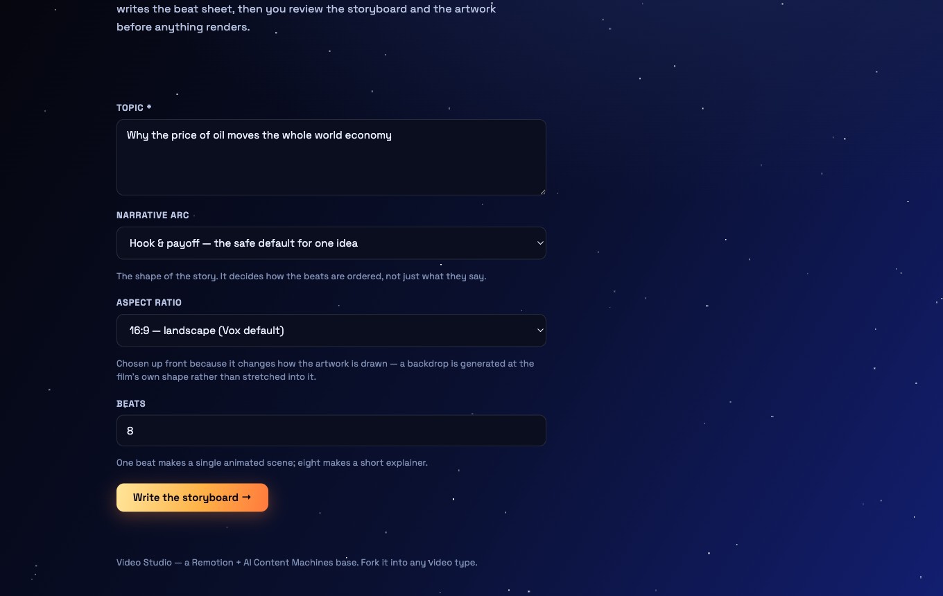
1Open Vox. Fill the four lines.Topic, narrative arc, aspect ratio, beats. Press Write the storyboard. Claude writes every beat.
-
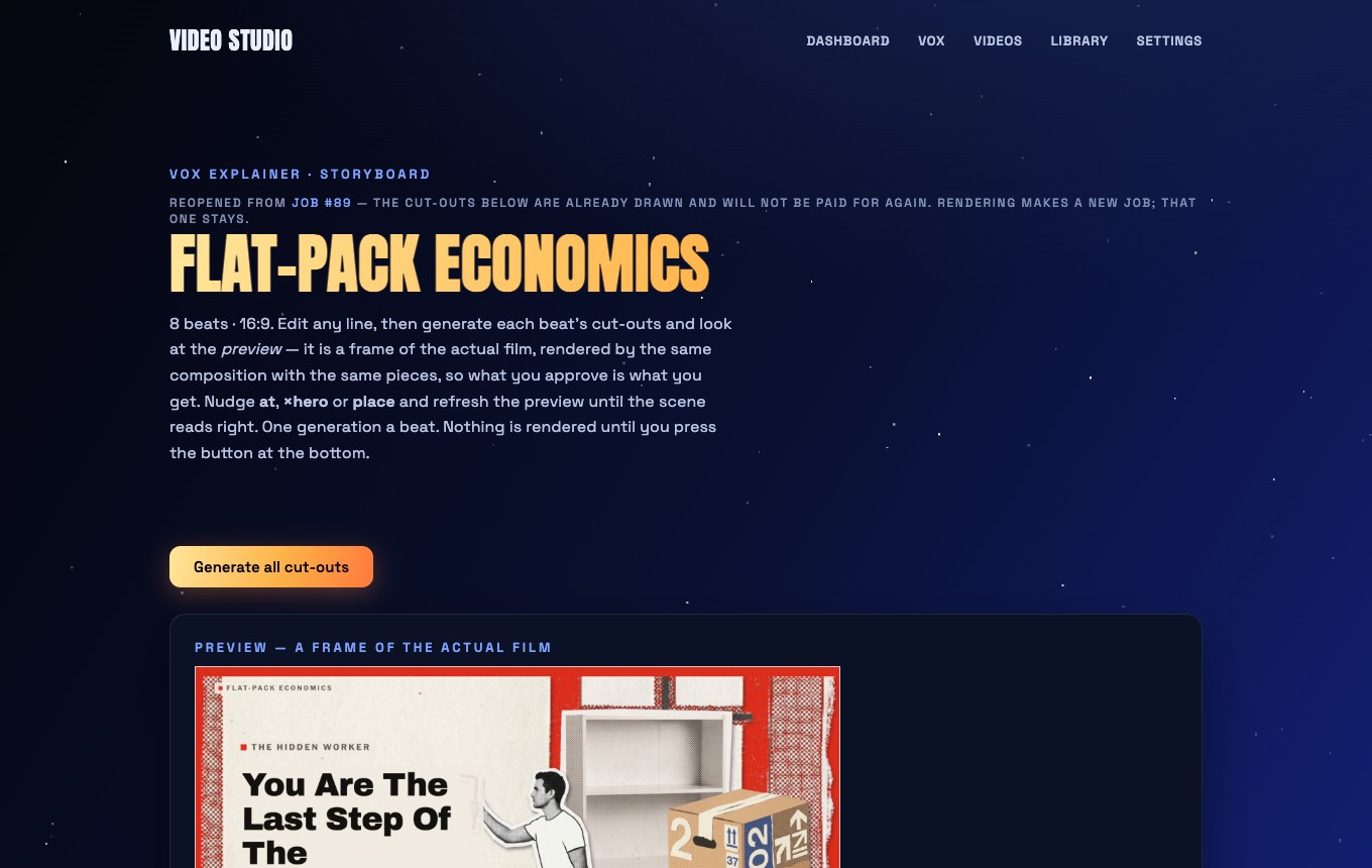
2Generate all cut-outs.One button draws every sheet with Nano Banana and slices the pieces automatically. Each beat lists its pieces back to front, with the staging, narration and headline you can edit.
-
3Check the preview of each beat.It is a frame of the actual film. Nudge
ator the scale, redraw or upload a single piece, pick the flat field colour, refresh.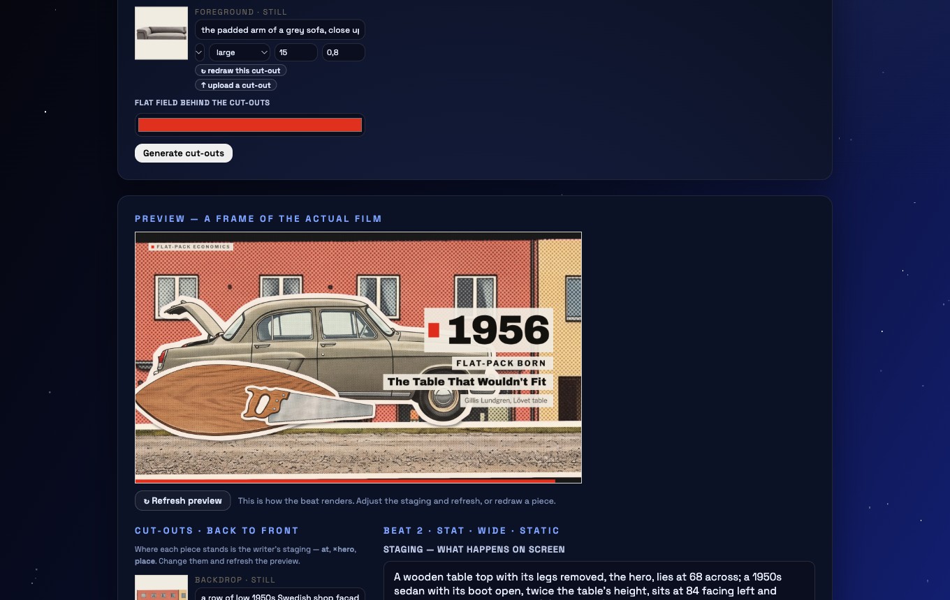
-
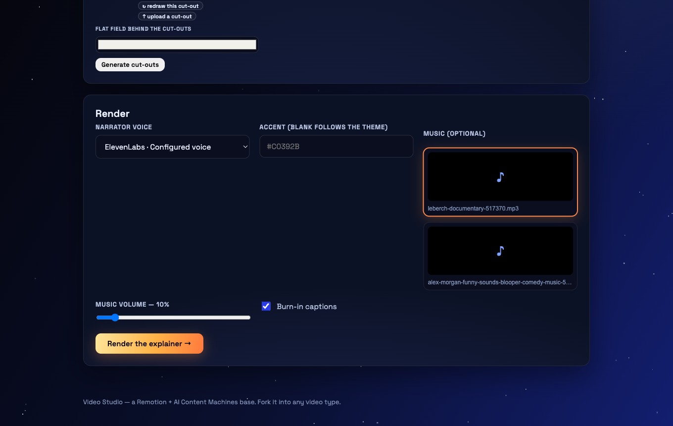
4Render.Choose the narrator voice (ElevenLabs or a local voice), music and volume, captions on or off. Press Render the explainer.
-
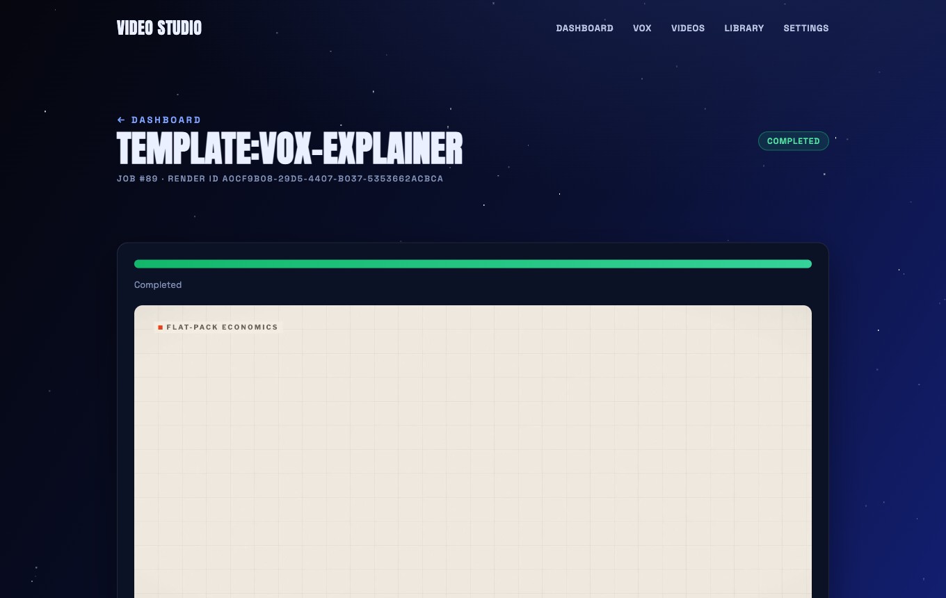
5Watch it. Download it.The job page shows progress, then the film. Reopen the storyboard any time to change a beat and render again. Pieces already drawn are not paid for twice.
Ready to make yours?
The Video Studio is inside the community, with every other machine.